Tab nav
Tab nav contains a set of links that let users switch between views in the same context.
On this page
On this page
Usage
A tab nav is used to organize related content into different views within the same context.
Best practices
- One of the tabs should be selected by default when the user loads the page.
- Keep tab labels as short as possible - ideally no more than three words.
- Avoid overwhelming the user with too many tabs. Instead consider a navigation structure like a nav list that's meant to handle more links.
- If a user navigates to a different tab panel, form data should not be automatically saved or submitted. Changes must be explicitly be saved or submitted.
- Don't nest a tab nav in another tab nav panel.
- Don't force users to switch between multiple tabs to compare info. Each tab panel should have all of the information a user needs to complete their task.
- Don't nest buttons or links in the tab title. The tab is already a link or button, so it cannot have a child element that is also a link or button.
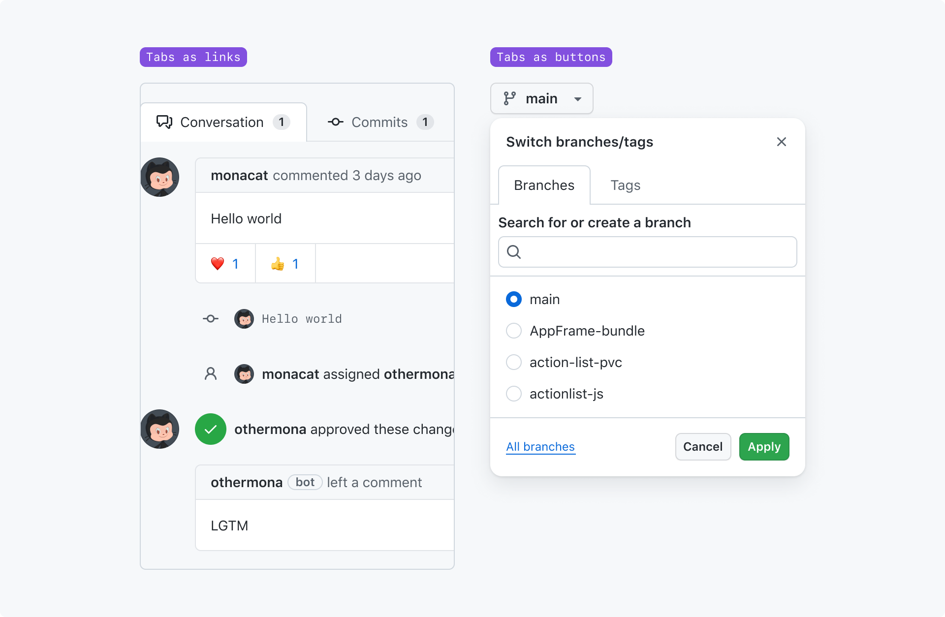
Tab nav is most often a set of links. When tabs are links, each tab should have a unique URL. However it's ok to treat tabs like buttons, especially when the tab nav appears in a context that cannot be linked to (a non-modal dialog, for example).
Anatomy
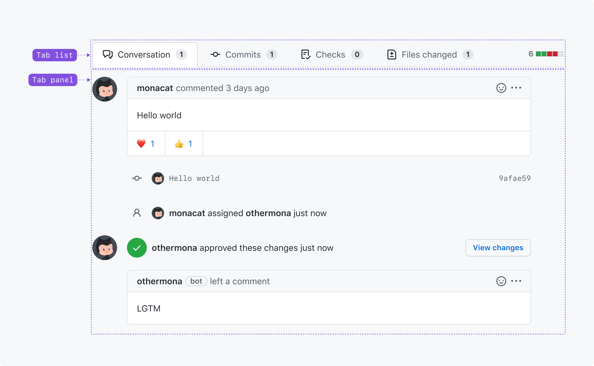
Tab list: A set of links used to switch between views. Each tab should concisely label the view it's associated with.
Tab panel: The view associated with the active tab.
Options
With related content after the tabs
Content or an action may be shown after the tabs as long as it's something that's relevant to the content in all of the tab panels. For example, a diff is shown after the tabs on a pull request.
However, the related content's element(s) cannot be nested in the element that has role="tablist".
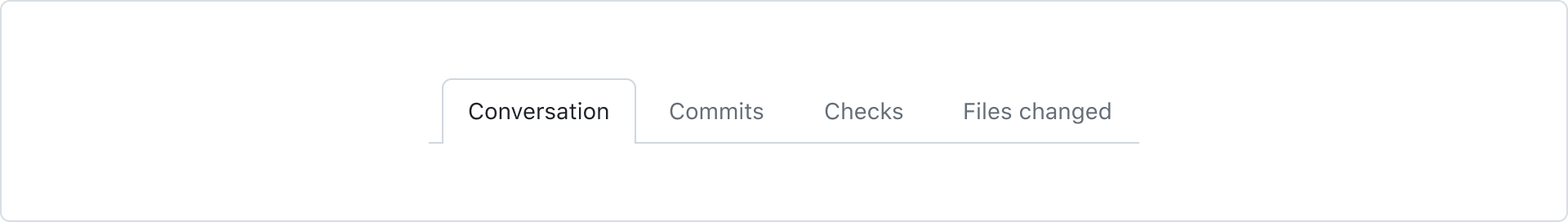
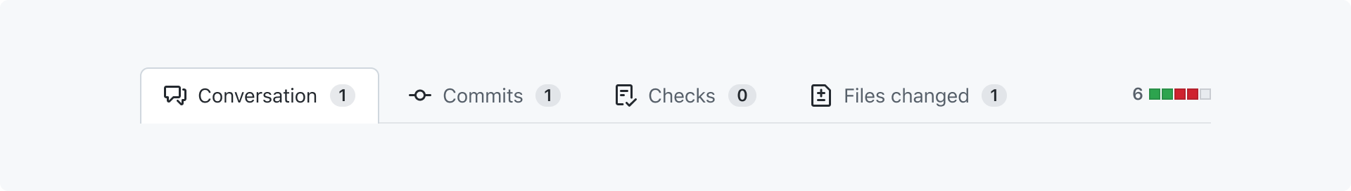
Tabs with counts
A count may be shown after the text label if the tab contains enumerable content that would be helpful for users to know without activating the tab.
Tabs with icons
An icon may be shown before the tab's text label to help users understand the purpose of the tab. For example, the number of files changed on a pull request's "Files changed" tab.
Accessibility
Each tab must have a unique text label for assistive technologies like screen readers. Avoid using tabs that only use an icon as their label. If an icon makes the tab easier to understand, consider pairing the icon with a text label.
Tabs may not overflow their container - they must be clickable without requiring the user to horizontally scroll. This is a violation of the WCAG reflow criteria.
Labeling counts
If your tab shows a count of items, screen readers will read the number immediately after the tab's label. Consider whether it would sound awkward to the user, and add visually hidden text to help make it easier to understand what the number is for.
For example, "Conversation 10" is confusing because there's no context for what the "10" is referring to. Instead, we can write our markup so screen readers will say "Conversation 10 comments".
If we assume that the sr-only class is used to only hide the element visually, that might look something like this:
<span>Commits<div class="badge">4<span class="sr-only"> comments</span></span>
Keyboard navigation
Tabs, like all interactive elements, can be activated using a cursor or keyboard.
When a user moves focus into the tablist using the Tab key, the active tab should be focused. A tablist is only a single Tab stop.
| Key(s) | Description |
|---|---|
Tab | Moves focus outside the tablist to the next focusable node. |
Enter | Activates the focused tab. |
ArrowLeft | Moves focus to the previous tab. If a user is focused on the first tab, focus wraps to the last tab. |
ArrowRight | Moves focus to the next tab. If a user is focused on the last tab, focus wraps to the first tab. |